 AI
AI
Customizing Material Components with Gradients
Jet Snack, the first Compose example app, used a custom design system with gradients on filter chips and buttons. Material components accept a single Color for backgrounds, not a Brush gradient. Developers often wrap a chip in a Box with a gradient background, manually handle shape and press states, then fork material source. Forks lose material defaults: accessibility, RTL positioning, interaction states. The new Styles API solves this by separating form from function and adding state-based styling and performance benefits.
What a Style Is and How to Use It
A style is an interface that defines a component’s appearance, implemented as a specialized modifier. Styles do not replace modifiers. They replace visual-property parameters. To make a custom button stylable, add a stylable modifier and a style parameter. Styles have four fundamentals: properties override each other (last defined wins), properties inherit from parent to child, styles are reusable (define once, use on many components), and styles are mergeable. Merging combines two styles; when same property appears twice, the later style’s value wins.
State-Based Styling and Animations
The API includes built-in states: default, pressed, hovered, and focused. Hovered and focused activate on mouse-equipped devices or TV D-pads. Add a state block inside the style lambda to change look per state, for example a light purple background on press. Without animations, the transition snaps. Surround any property with an animate lambda for automatic tween between states. Pass a custom animation spec such as tween with longer duration to slow the effect. This eliminates manual Animatable state variables.
Custom Style States and Performance Gains
The StyleState class stores interaction states and supports custom states via a map-like get operator. In Jet Snack, the add-to-cart button needed loading, loaded, and error visuals. A custom enum, a StyleStateKey, and extension functions on StyleScope enable the button to read and react to loading state. Restricting extension functions to a custom LoadingStyle scope makes invalid states a compile-time error. Performance improves because styles use a single modifier, skip composition when only draw changes, and defer animation creation. A border benchmark showed 70% fewer allocations and up to 2.3x faster rendering. A material button prototype cut allocations 37% and rendered 1.6x faster.
Integrating Styles into Themes and Media Queries
Add a component-defaults style layer to the theme, accessing color, shape, and typography tokens. The button composable resolves styles in a precedence hierarchy: incoming style parameter, themed default, inherited parent styles. For dark/light mode, styles automatically adapt because they read composition locals. Material 3 components will expose style parameters in a future release. The experimental MediaQuery API returns window characteristics as booleans; styles re-evaluate when the condition changes. For example, a button can shrink padding and size on devices with a mouse connected.
Notable Quotes
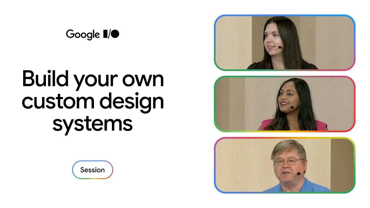
Styles are not here to replace modifiers, but instead here to replace parameters that are related to visual properties. Meghan Mehta · ▶ Watch (4:09)
In this benchmark, styles had approximately 70% fewer allocations and used up to 2.3 times faster to render the next pixel. Chuck Jazdzewski · ▶ Watch (24:56)
When a layout property such as content padding changes, only layout and draw run. If a draw property such as background changes, only the draw phase runs. Chuck Jazdzewski · ▶ Watch (25:10)
Choose a style when you want to override default existing the defaults for an existing component, perform high performance interactive state animations, or to define themewide sets of properties for a component. Chuck Jazdzewski · ▶ Watch (34:59)
Key Takeaways
- Styles replace visual parameters with a single, reusable style modifier.
- State-based styling and animations are built in, requiring no extra state variables.
- Custom style states limit extension functions to components that support them.
- Styles reduce allocations and render faster than equivalent modifier chains.
- MediaQuery unlocks adaptive themes across device form factors.